Report | Crowd Forecasting - Comparison Survey
Relative Risks of State-Led Mass Killing Onset in 2014: Results from a Comparison Survey
Introduction
In early December we launched a wiki survey to help assess risks of state-led mass killing onsets in 2014; the results are here.
As part of our ongoing work for the Holocaust Museum’s Center for the Prevention of Genocide, Ben Valentino and I launched a wiki survey to help assess risks of state-led mass killing onsets in 2014 (here).
The survey is now closed and the results are in. Here, according to our self-selected crowd on five continents and the nearly 5,000 pairwise votes it cast, is a map of how the world looks right now on this score. The darker the shade of gray, the greater the relative risk that in 2014 we will see the start of an episode of mass killing in which the deliberate actions of state agents or other groups acting at their behest result in the deaths of at least 1,000 noncombatant civilians from a discrete group over a period of a year or less.
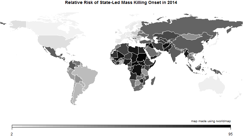
Smaller countries are hard to find on that map, and it’s difficult to compare colors across regions, so here is a dot plot of the same data in rank order. Countries with red dots are ones that had ongoing episodes of state-led mass killing at the end of 2013: DRC, Egypt, Myanmar, Nigeria, North Korea, Sudan, and Syria. It’s possible that these countries will experience additional onsets in 2014, but we wonder if some of our respondents didn’t also conflate the risk of a new onset with the presence or intensity of an ongoing one. Also, there’s an ongoing episode in CAR that was arguably state-led for a time in 2013, but the Séléka militias no longer appear to be acting at the behest of the supposed government, so we didn’t color that dot. And, of course, there are at least a few ongoing episodes of mass killing being perpetrated by non-state actors (see this recent post for some ideas), but that’s not what we asked our crowd to consider in this survey.
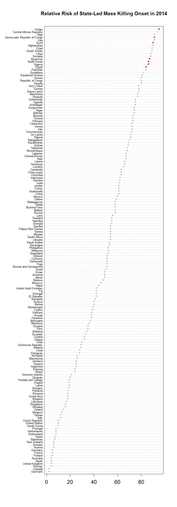
It is very important to understand that the scores being mapped and plotted here are not probabilities of mass-killing onset. Instead, they are model-based estimates of the probability that the country in question is at greater risk than any other country chosen at random. In other words, these scores tell us which countries our crowd thinks we should worry about more, not how likely our crowd thinks a mass-killing onset is.
We think the results of this survey are useful in their own right, but we also plan to compare them to, and maybe even combine them with, other forecasts of mass killing onsets as part of the public early-warning system we expect to launch later this year.
In the meantime, if you’re interested in tinkering with the scores and our plots of them, you can find the code I used to make the map and dot plot on GitHub (here) and the data in .csv format on my Google Drive (here). If you have better ideas on how to visualize this information, please let us know and share your code.
UPDATE: Bad social scientist! With a tweet, Alex Hanna reminded me that I really need to say more about the survey method and respondents. So:
We used All Our Ideas to conduct this survey, and we embedded that survey in a blog post that defined our terms and explained the process. The blog post was published on December 1, and we publicized it through a few channels, including: a note to participants in a password-protected opinion pool we’re running to forecast various mass atrocities-related events; a posting to a Conflict Research group on Facebook; an email to the president of the American Association of Genocide Scholars asking him to announce it on their listserv; and a few tweets from my Twitter account at the beginning and end of the month. Some of those tweets were retweeted, and I saw a few other people post or tweet their own links to the blog post or survey as well.
As for Alex’s specific question about who comprised our crowd, the short answer is that we don’t and can’t know. Participation in All Our Ideas surveys is anonymous, and our blog post was not private. From the vote-level data (here), I can see that we ended the month with 4,929 valid votes from 147 unique voting sessions. I know for a fact that some people voted in more than one session—I cast a small number of votes on a few occasions, and I know at least one colleague voted more than once—so the number of people who participated was some unknown number smaller than 147 who found their way to the survey through those postings and tweets.